Pulse App
Making team messaging feel human, calm, and organized.
date
[
Jan 17, 2026
]
client
[
Pulse
]
industry
[
SaaS
]
timeline
[
10 Weeks
]

[
introduction
]
[
01
]
Pulse is a messaging tool for remote teams, trying to compete with Slack. Their problem was that their app felt "clunky" and slow. Users were getting annoyed with the constant notifications and the messy layout. We redesigned their entire identity to feel lighter, faster, and more human.
[
Challenge
]
[
02
]
Users were constantly stressed out. The app was cluttered with too many red dots and urgent alerts, which overwhelmed them. Instead of a helpful tool, it felt like "work" and created a sense of cognitive overload.
[
solution
]
[
03
]
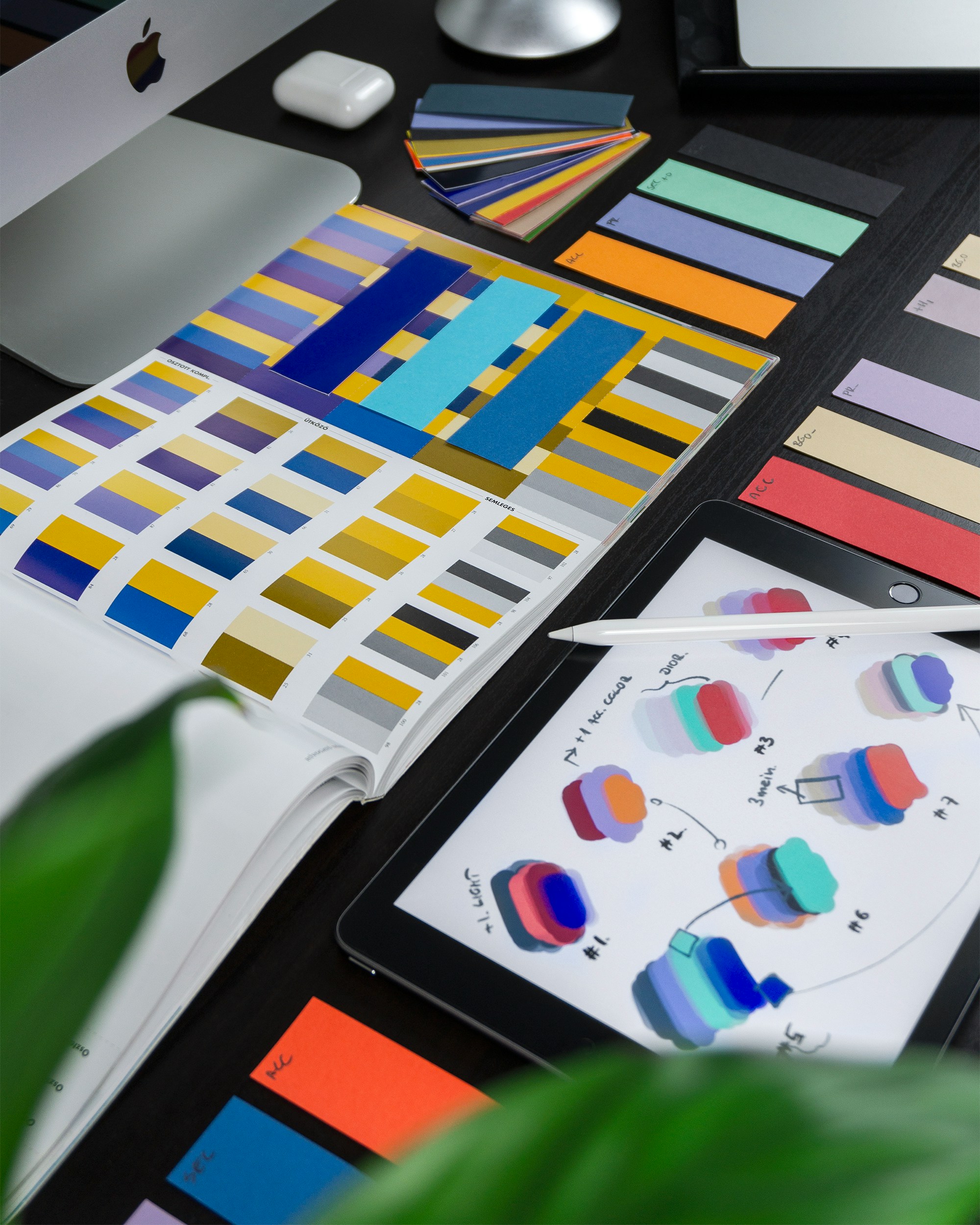
We softened the UI by using a calm pastel color palette to reduce visual stress. To make the interface feel more modern and approachable, we rounded the corners of every button and container. Finally, we introduced a dedicated 'Focus Mode' that hides all distracting sidebars, allowing users to fully immerse themselves in their writing without interruptions.

[
The Outcome
]
[
04
]
4.8
New rating on the App Store.
+20%
Increase in Daily Active Users.
15%
Faster load times for messages.
